The problem: Android devs generally given designs for iPhone. “But that’s just like Android, right?”
Rid the world of these iPhoney apps now.
Used to be like windows apps on Apple. People still do iOS first, Android is an afterthought.
Android users want Android apps.
Android users can tell when it’s an iPhone port.
Android users will slate you if you’re a lazy sod. Poor engagement. App won’t be a success.
The problem with graphic designers: Designers design to the pixel in photoshop. Pixel perfect designs for two sizes.
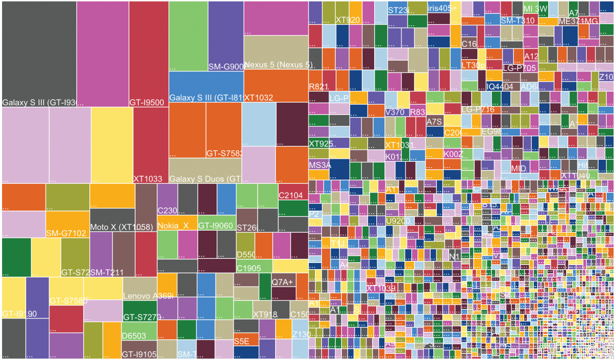
You can do it for iPhone (3, 2 duplicates), but not for Android. Popular app, had 428 different screen resolutions one month after going live.
Pixel perfect for Android is impossible:
- Use principles of responsive design.
- Define stretch areas, horizontally and vertically.
- Use spacers.
- Define boundary points (doesn’t work for Gingerbread and earlier)
Problem with designers:
- Talk in pixels, not in DIPs (density-independent pixels) or SPs (scalable pixels).
- Everything in Android should only be designed in DIPs, test in SPs.
- They measure to font baseline, not font padding.
- Helvetica and Roboto look similar, but have very different padding.
Designers need to learn Android:
- Teach them DIPs and then SPs.
- Try “DIPs are like pre-Retina pixels”.
- Teach them responsive app design.
- Teach them Android Design Guidelines.
- Landscape mode is a first-class citizen.
- Have an intervention – confiscate their iPhones.
Big no-no’s:
- iPhoney icons.
- Back button of doom (don’t have it, use the physical one).
- Carets of contention (don’t put carets at the end of list view lines).
- Big up, big downer.
Navigation is owned by the platform:
- Use Android navigation patterns on Android.
- Action, navigation bar, view pages.
- Keep is 100% Android above the line (navigation bar, draw).
- Use action bar action mode.
Get the action bar absolutely right:
- Ensure up button works everywhere.
- Use 70/30 rule for action buttons.
- If needed 70% of the time, bar, else in menu.
- Use official Android navigation drawer.
Avoid developer art: nail your specs.
Need to work with designer to get the specs absolutely right.
Material Design:
- Announced at I/O in June.
- Material is the metaphor.
- One adaptive design.
- Unified experience across multiple devices.
- Consistent look and feel.
Case study: The Sun Mobile
The Sun saw an earlier version of this talk at Droidcon last year.
- Same as iOS with Android navigation.
- Responsive design.
- Add Android extras: here, a daydream (whilst your phone is charging).
Reactions:
- Feedback creeping up, was 2.9 now 3.4.
- Customer is delighted, particularly with the on boarding.
- Has commissioned lots of follow-up work.
Case study: BBC Weather
- Enormous brand, Unbelievable market share.
- BBC identified need for a weather app.
- Unsure whether to go native or responsive.
Designs were iOS designs.
Professional designers say “this should be android”, get this as an Android dev all the time.
Add fun Android stuff:
- NFC support
- So many reviews picked up on this.
- New android features:
- Lock screen widgets
- Daydream mode
- Dashclock
- No need to shout about it, early adopters will do it for you.
- Ratio of 5* to 1* reviews was 100:1
- Featured in play store.
- Client really happy.
- #1 free app for a while.
Summary:
- Get product manager onside with Android.
- Get graphic designers on board with Android. They need to understand what you are doing.
- Suggest where Android can improve the product.
- Compare to best-of-breed to argue.
- Get Action bar absolutely right.
- Add Android-related flourishes and fun stuff.

One reply on “iOSDevUK: Kenton Price: Teaching Your Client Android Design or Don’t be an iPhoney”
My notes from @LFT_Android’s awesome talk at #iOSDevUK: Teaching Your Client Android Design or Don’t be an iPhoney – http://t.co/MHO7HngrFd